
Oiastok Web System
Enterprise-grade UX for vehicle trading: heatmaps, API-powered plate lookups, and reports that accelerate profitable buy/sell decisions.
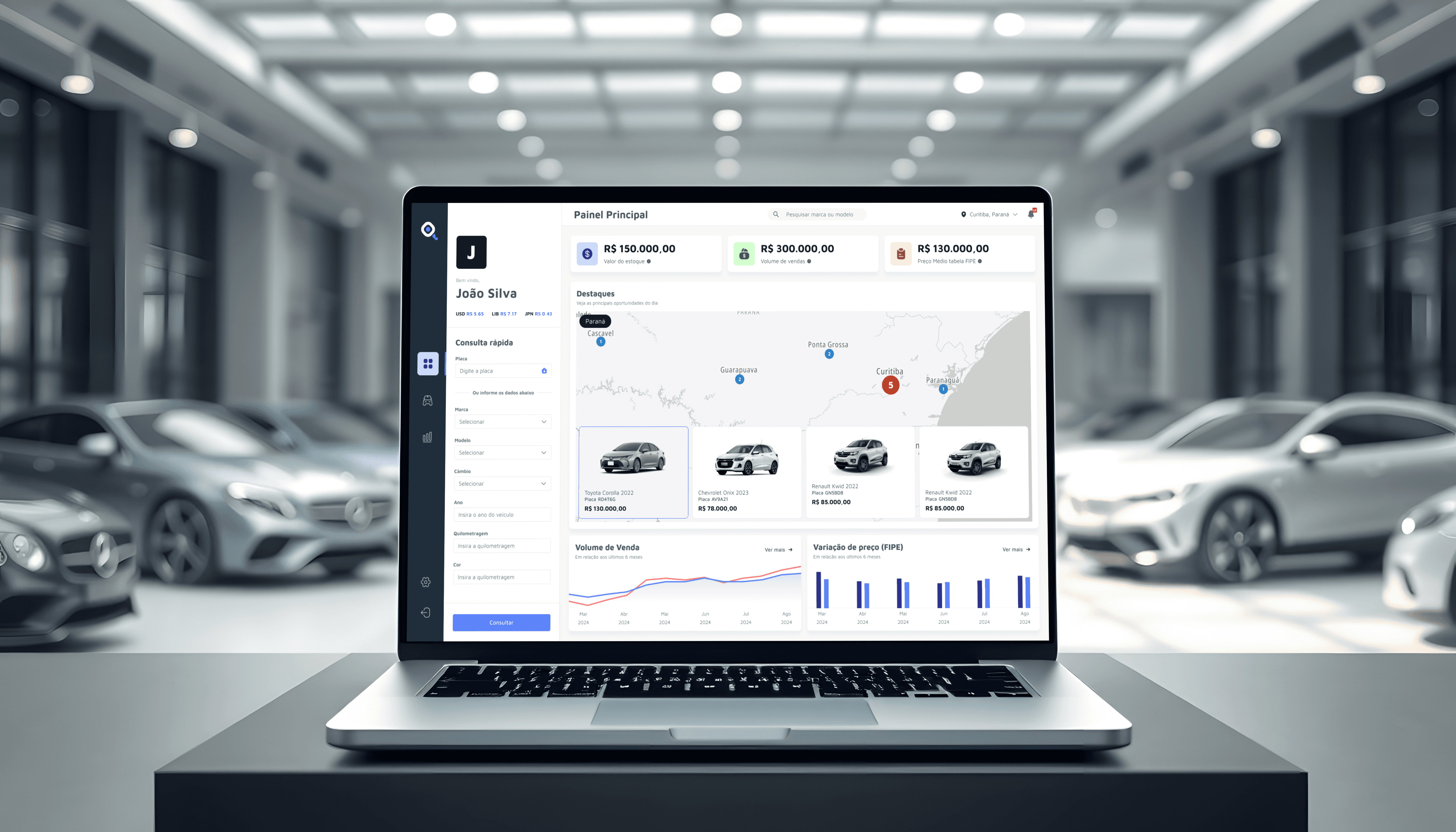
Discovery phase
The engagement framed a clear business goal: enable vehicle resellers to spot regional opportunities fast, manage inventory with confidence, and act on market signals for quick turnarounds. Scope included an acquisition landing page, authentication, an Analysis dashboard with a regional opportunity heatmap, Inventory management, Reports & Trends, and an Exclusive Showcase of time-sensitive deals.
Early constraints and enablers were defined: integrations with leading price tables, plate-based lookups to pre-fill specs (chassis, model, color, etc.), and non-functional targets around speed, reliability, and data legibility. Success was expressed as shorter time to qualify an opportunity, fewer manual entries, and consistent decision support across regions.
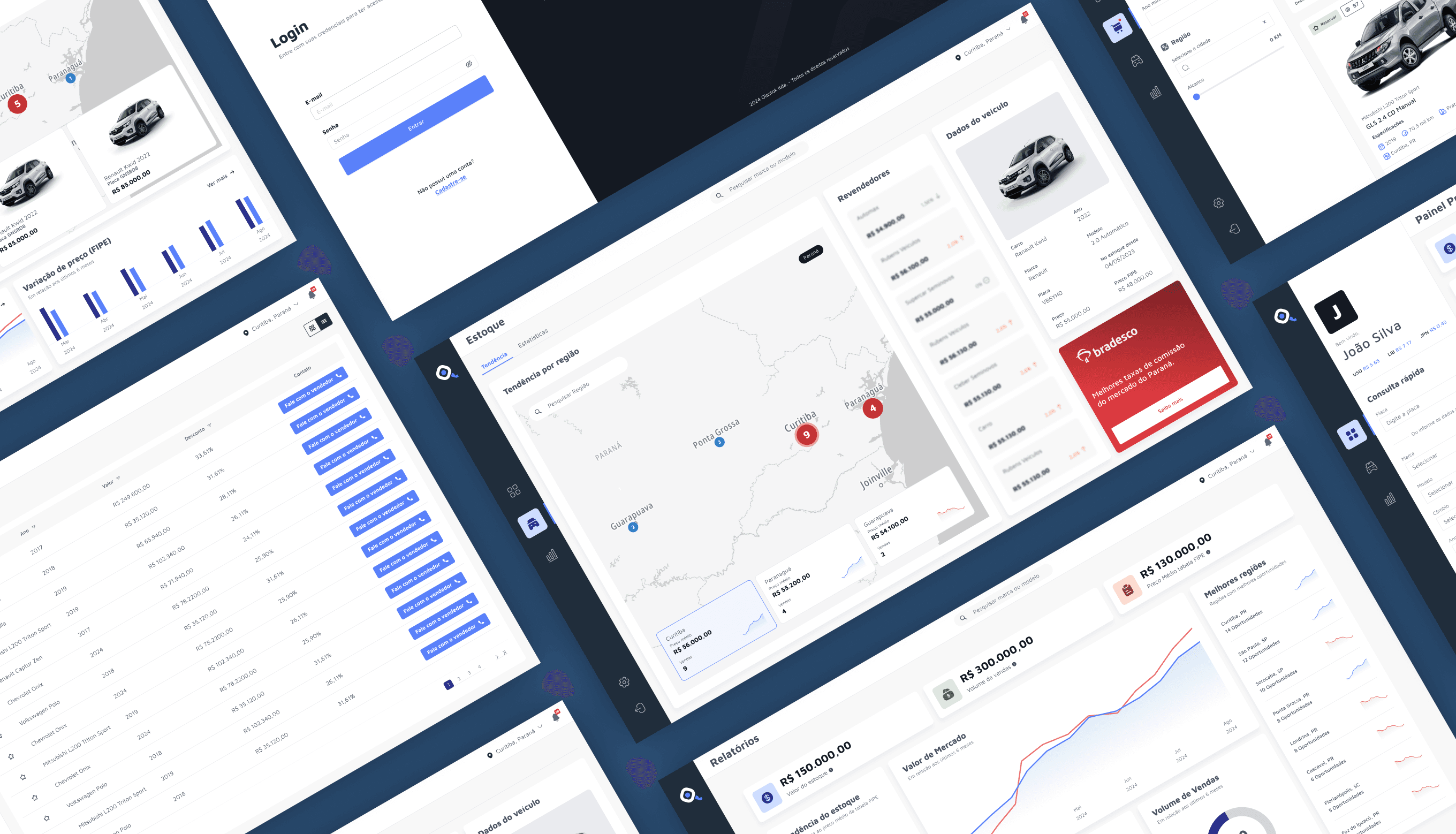
Ideation Development
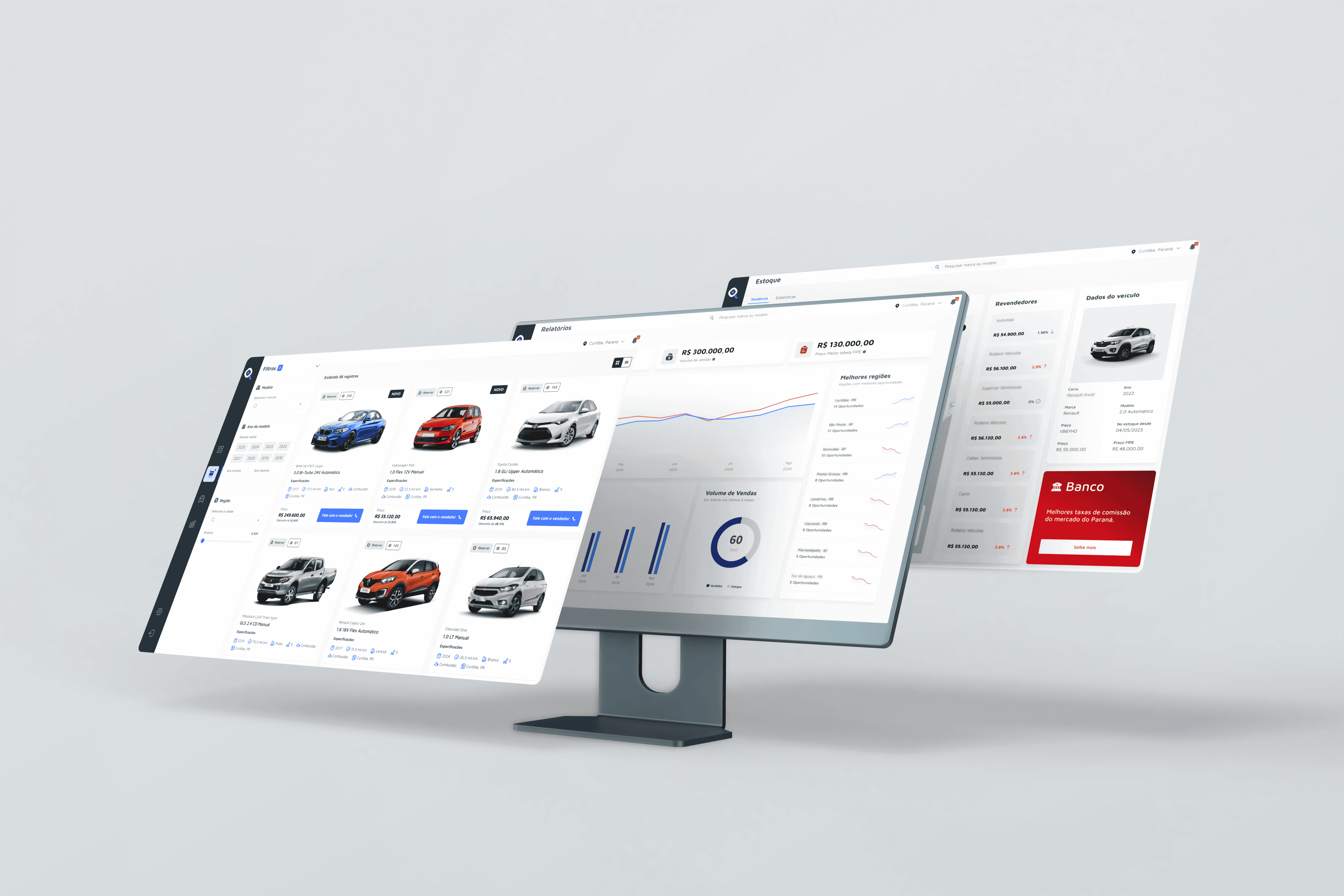
Information architecture organized the product into focused modules—Analysis, Inventory, Reports, Showcase, and Account—supported by core flows for vehicle intake, list + advanced filters, and model/spec details with comparable prices. Flows emphasized one-screen completion for frequent actions and predictable navigation across table-heavy views.
Interaction patterns favored reliability at scale: optimistic updates with validation fallbacks, explicit states for API latency/failure, and consistent filter/sort behaviors. A lean component library (tables, filters, chips, cards, map overlays, legends) enabled coherent behavior and faster iteration, culminating in a navigable prototype and a scoped backlog ready for implementation.
UI/UX
Web System
Visual Identity
Visual Exploration
The visual identity balances enterprise clarity with commercial appeal. Typography and spacing create readable hierarchy for dense datasets; a neutral surface palette supports high data density, while accent colors guide action and status. Heatmap and chart treatments use an accessible ramp with clear legends, thresholds, and hover details for rapid scanning.
At the symbol level, the mark combines a key with a magnifier/eye, signaling access, search, and analysis. The logo is animated to blink and glance side-to-side, adding a lively, observant personality that reinforces the product promise of continuously “looking” for opportunities.
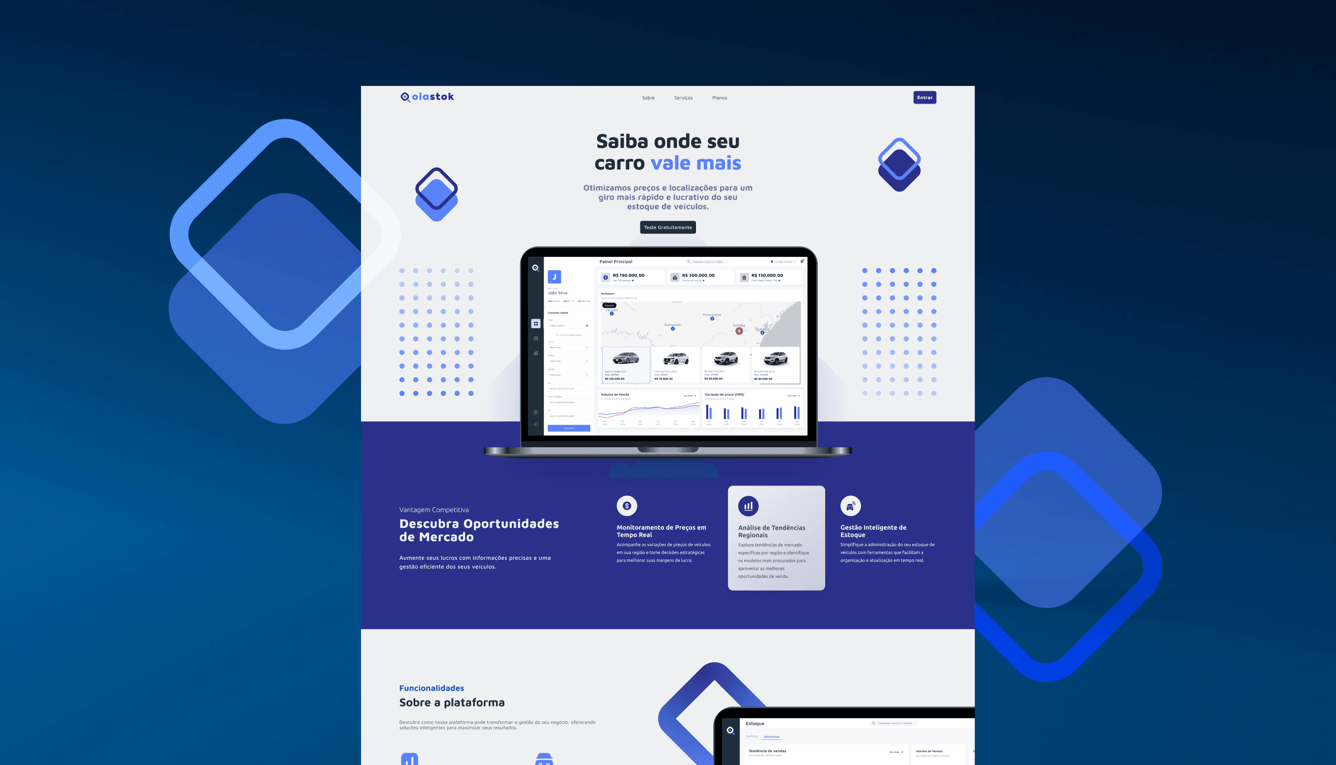
Brand Application
Positioning presents Oiastok as regional vehicle-trading intelligence: pragmatic, trustworthy, and fast. On the landing page, messaging leads with the heatmap advantage, API-powered plate lookups, and exclusive deals, supported by concise benefit statements and clear CTAs. Design tokens (color, type scale, spacing, radius) ensure consistency and streamline development handoff.
Inside the app, brand tone informs microcopy, helper text, and iconography, reinforcing “act now with confidence.” States (empty, error, success) are branded for clarity, and the Showcase and Reports modules highlight urgency and insight. Support content remains close to tasks, enabling quick adoption without training overhead.
Case study
How I approached the problem
A short walk through the reasoning behind this project — the context I was solving for, what I owned, the decisions that shaped it, and what changed as a result.
Timeline
2024 · ~3 months
Platform
Enterprise web app
Scope
Discovery → UI system → Handoff
Methods
Research · IA · Prototyping · Tokens
01
Context
Vehicle resellers were qualifying regional opportunities by hand — jumping between price tables, spreadsheets, and chat threads. The business goal was sharp: help dealers see where to buy and sell faster, manage inventory with confidence, and act on market signals before the window closed. The real challenge was turning dense, table-heavy data into decisions a busy reseller could trust at a glance.
02
Role & ownership
I led product design end to end as the sole designer — framing the problem with stakeholders, shaping the information architecture, and designing the dashboard and data-table system through to a developer-ready handoff. I partnered closely with engineering on data states, latency and validation behavior so the design held up under real volume.
03
Key decisions
I chose a modular dashboard over a stack of isolated screens, so Analysis, Inventory, Reports and Showcase could share one language. I standardized tables, filters and empty/error/loading states early to keep behavior predictable across data-heavy views. For high-frequency actions I designed for one-screen completion and used plate-based lookups to pre-fill vehicle specs. Every call optimized for time-to-qualify — not just screens that looked clean.
04
Outcome & impact
Qualifying an opportunity went from scattered manual work to a guided, repeatable flow. The shared component system made the product faster to extend as new modules were added, and the explicit data states gave the team a reliable foundation. It shipped as a navigable prototype plus a scoped backlog ready for implementation.
We value your privacy
We use necessary cookies to make this site work. With your permission, we may also use optional cookies to understand site usage and improve your experience. You can accept or reject optional cookies at any time. Privacy Policy