
Vendedora de Sucesso (SaaS)
A clarity-first web platform for small sellers: track expenses, organize schedules, manage stock, and decide with confidence.
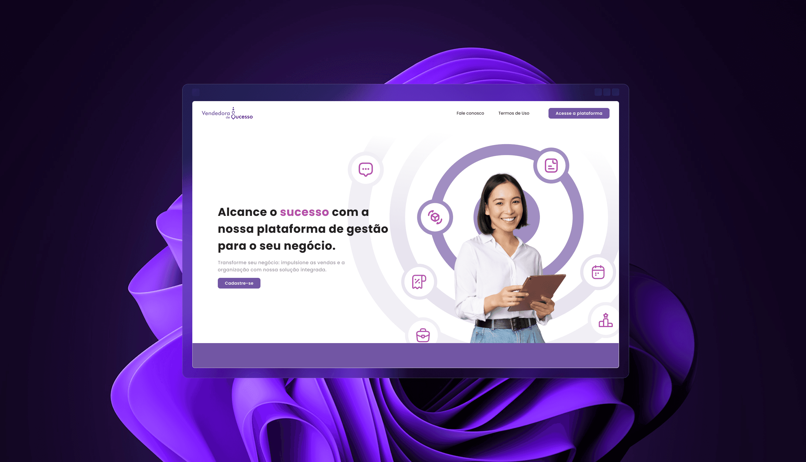
Discovery phase
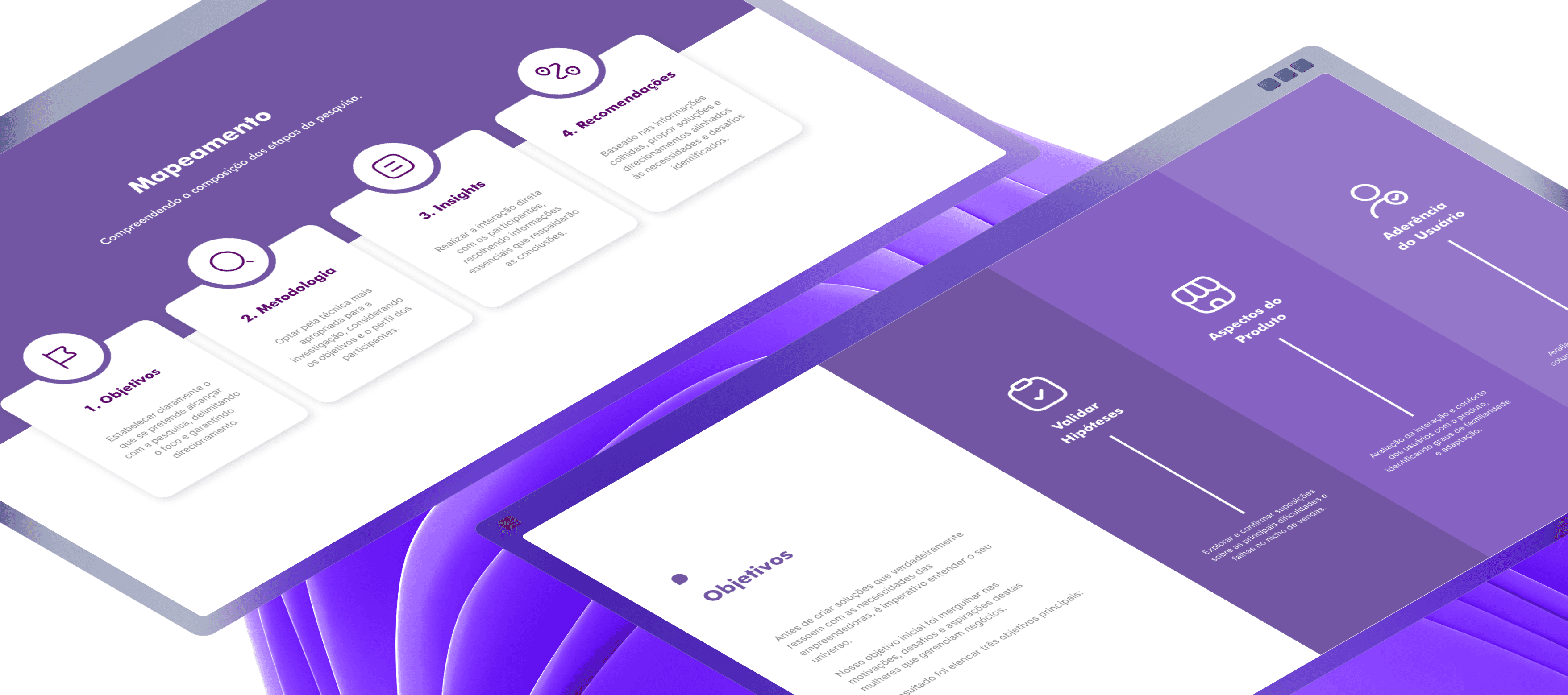
A single-threaded, end-to-end approach aligned branding and product discovery from day one. The market scan focused on women small-business owners and sales professionals, mapping adjacent tools, tone of voice, and onboarding patterns to avoid clichés and surface opportunities for clarity and trust. Working hypotheses centered on fragmented records across apps, low visibility of cash flow, weak follow-up cadence, and manual stock control.
A quantitative survey validated and refined those hypotheses. The questionnaire captured demographics, tech familiarity, routines, and channel usage; the resulting charts revealed behavior clusters that informed MVP priorities: make recurring tasks effortless (record expense, schedule follow-up, update stock), surface immediate visibility through simple summaries, and maintain inclusive, direct language across the experience.
Ideation Development
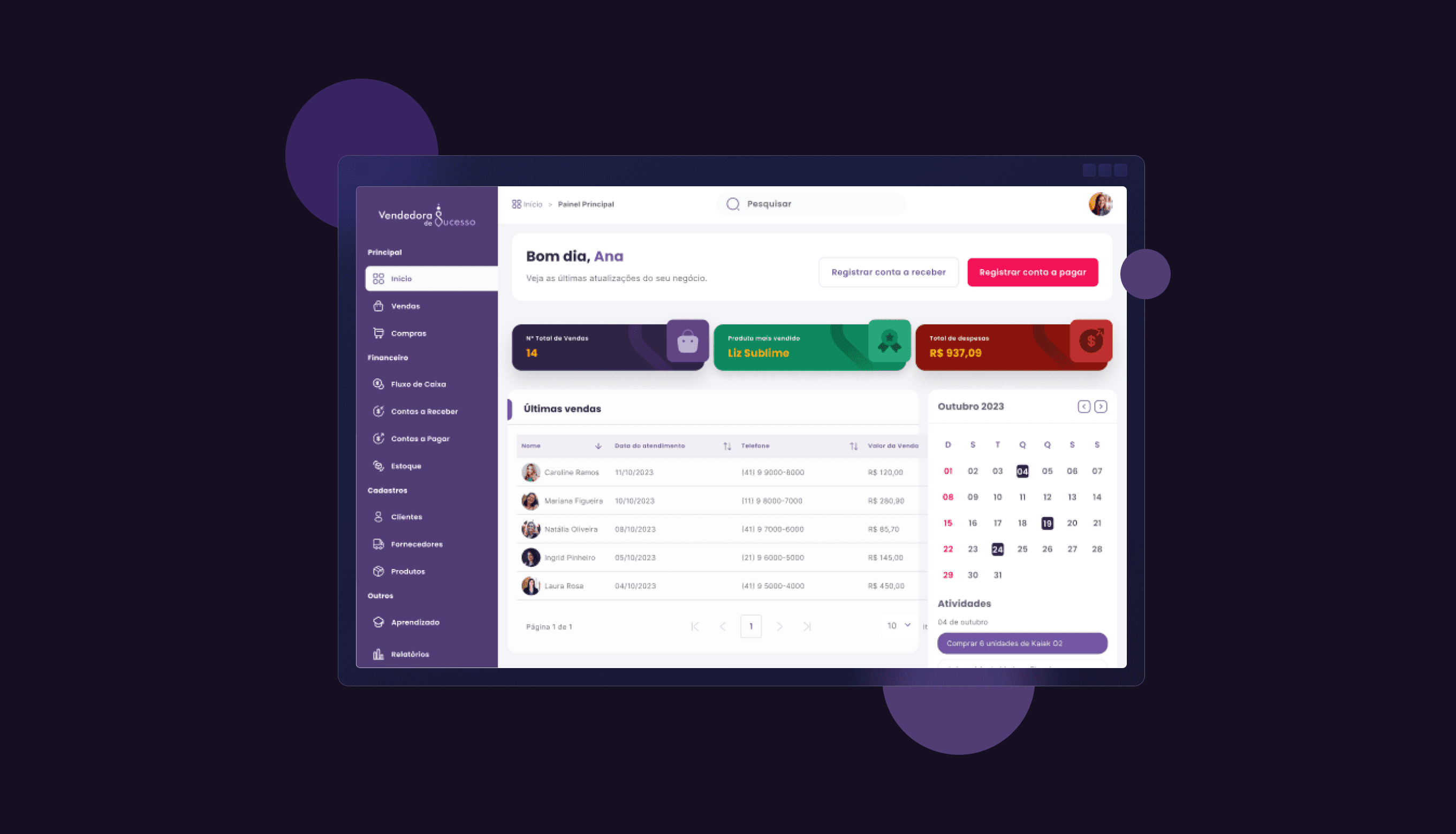
Insights were translated into information architecture and lean workflows spanning Authentication/Onboarding, Dashboard, Finances, Contacts, Agenda, Products/Inventory, Reports/Insights, and an in-product Support area. Proto-personas, Jobs-to-Be-Done, and success criteria (time to complete key tasks, rate of next-step defined, error reduction) provided decision guardrails. Low-fidelity flows exposed edge cases and states before moving to interactive prototypes.
Design choices favored one-screen completion for frequent actions, predictable navigation, and explicit empty/error/success states. A hypothesis backlog tied to each module guided iteration, and a content strategy defined microcopy and tutorial structure. The outcome was a navigable prototype and a scoped backlog ready for implementation.
UX/UI
Software as a Service
Visual Identity
Visual Exploration
Brand exploration avoided gendered stereotypes in favor of a confident, pragmatic tone. Palette and typography were selected for legibility and WCAG contrast, with calm primaries and neutral surfaces to support data density. Iconography, spacing, and type scale emphasized scannability for table-heavy views and mobile breakpoints.
Component styling prioritized clarity over ornament: clear input affordances, accessible focus/hover states, precise validation messaging, and helpful empty-state guidance. Chart treatments optimized quick comparisons—trend lines and simple aggregates—rather than decorative visuals. The visual language remained consistent from landing to app to integrated support content.
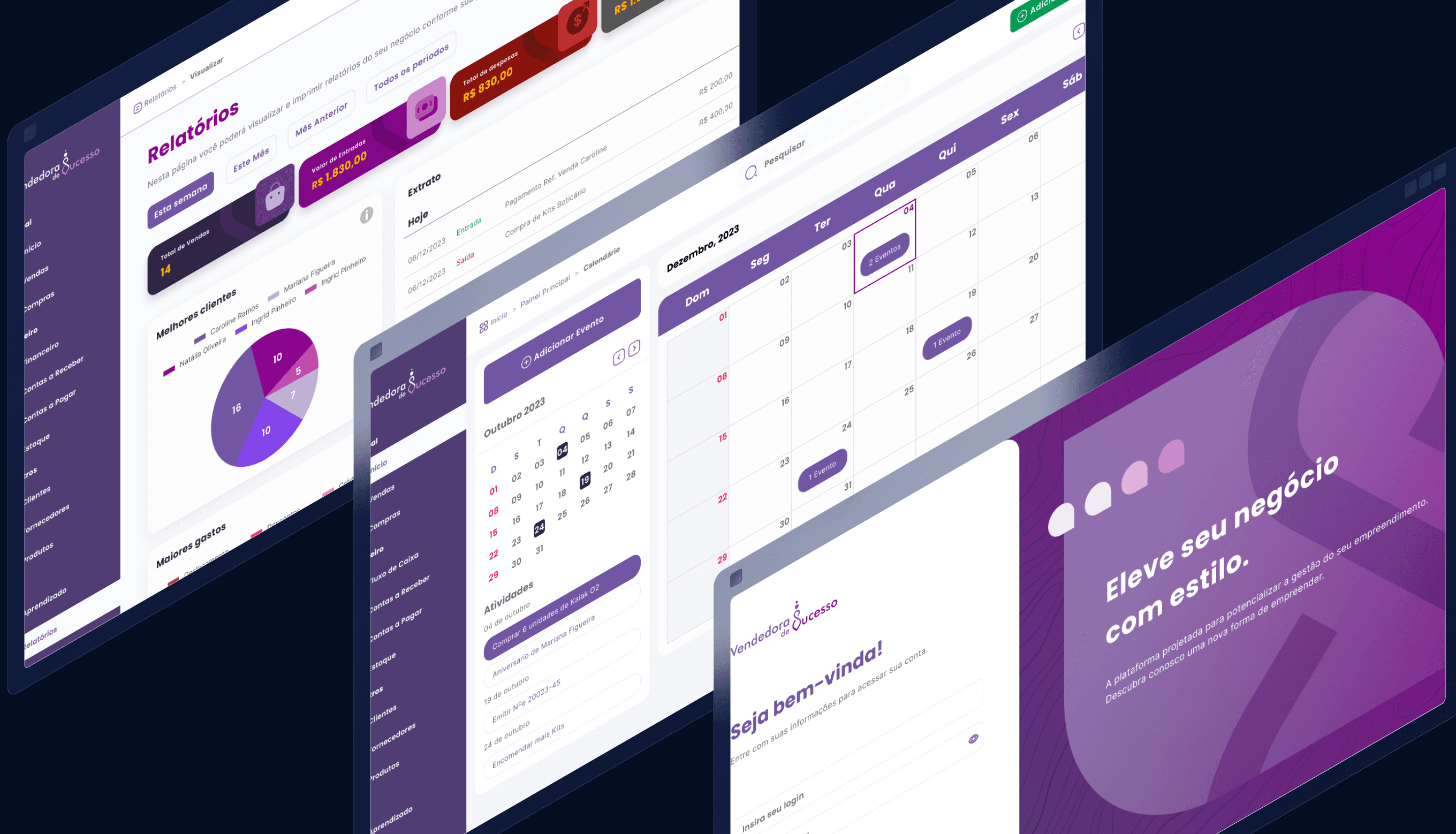
Brand Application
The identity translated into a SaaS interface and an acquisition landing page using tokens (color, type scale, spacing, radius) for consistency and efficient handoff. CTAs, headlines, and social proof on the landing balanced credibility and accessibility, guiding visitors toward sign-up with clear value statements anchored in everyday workflows.
Each module — Dashboard, Finances, Agenda, Contacts, Products/Inventory, Reports—was prototyped with realistic states and sample data. The project concluded in roughly three months with positive client feedback; usage telemetry was not collected, and a measurement plan was left as a recommended next step.
Case study
How I approached the problem
A short walk through the reasoning behind this project — the context I was solving for, what I owned, the decisions that shaped it, and what changed as a result.
Timeline
2023 · ~3 months
Platform
Responsive web SaaS
Scope
Brand + product, end-to-end
Methods
Survey, JTBD, IA, prototyping
01
Context
A B2B SaaS platform helping sales professionals organize pipelines, track performance, and act on the right opportunities.
02
Role & ownership
Senior Product Designer — defined the UX architecture, design system foundations, and key conversion and retention flows.
03
Key decisions
Chose progressive disclosure for complex data, clarified the pipeline hierarchy, and aligned onboarding with the first valuable action.
04
Outcome & impact
A clearer path from sign-up to active use, with reusable patterns that let the product expand without redesigning every screen.
We value your privacy
We use necessary cookies to make this site work. With your permission, we may also use optional cookies to understand site usage and improve your experience. You can accept or reject optional cookies at any time. Privacy Policy